When designing my final set of posters, I started with a set of drafts and final iterations of each character. Initially, the final set would include close-ups of each character, but I decided to change this. The final versions would have a full-body shot of each character, with a low-opacity close-up in the background. This made the posters more interesting and dynamic.
When editing the character solo posters, I found there was a lot of empty space in the background. To remedy this, I drew a cityscape and traced it in Illustrator. Initially, it would be in full colour and would have details such as windows, but this made the background look too cluttered. For the final background, I settled on a minimalist approach, using simple outlines to fill the space.


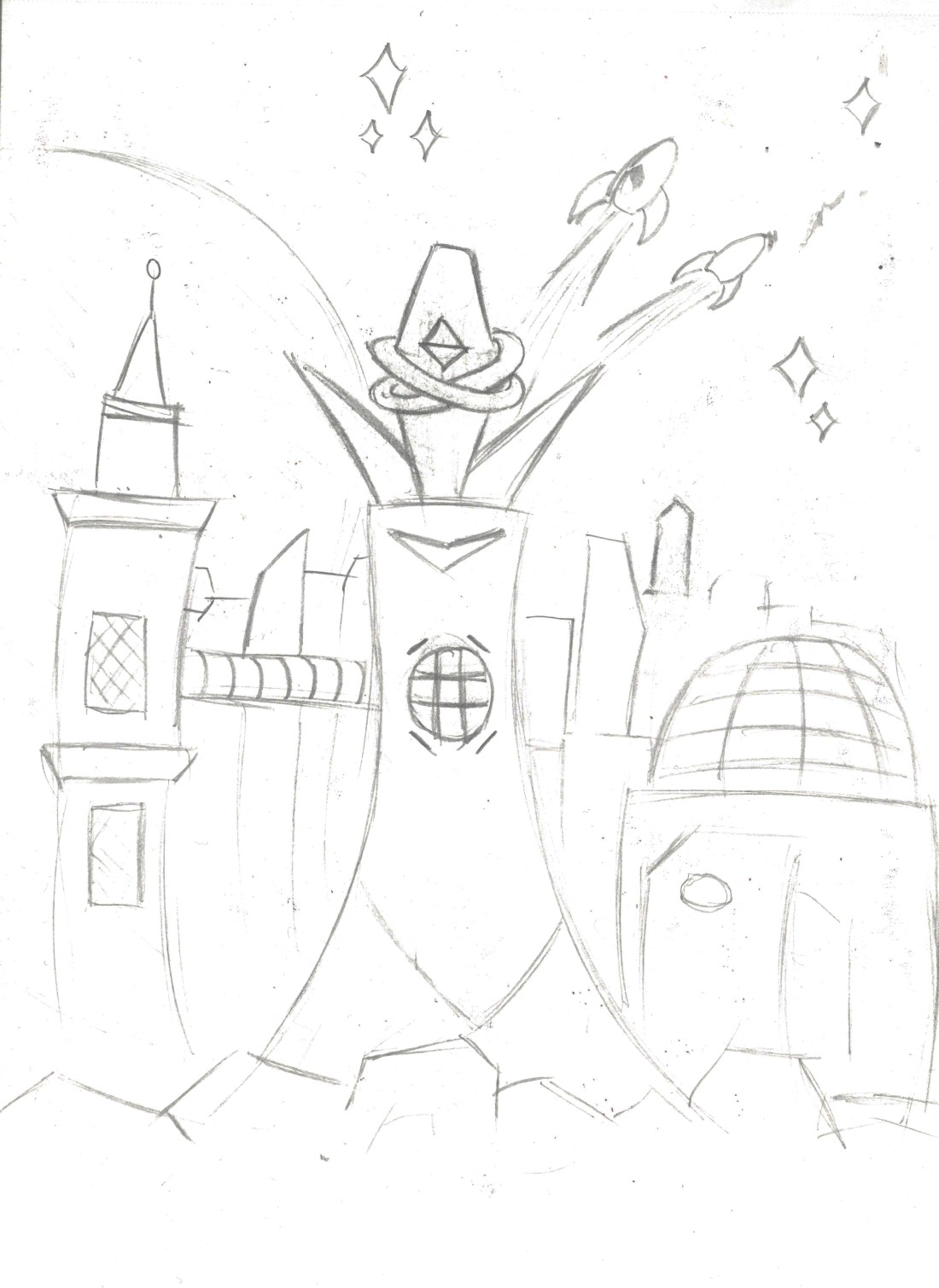
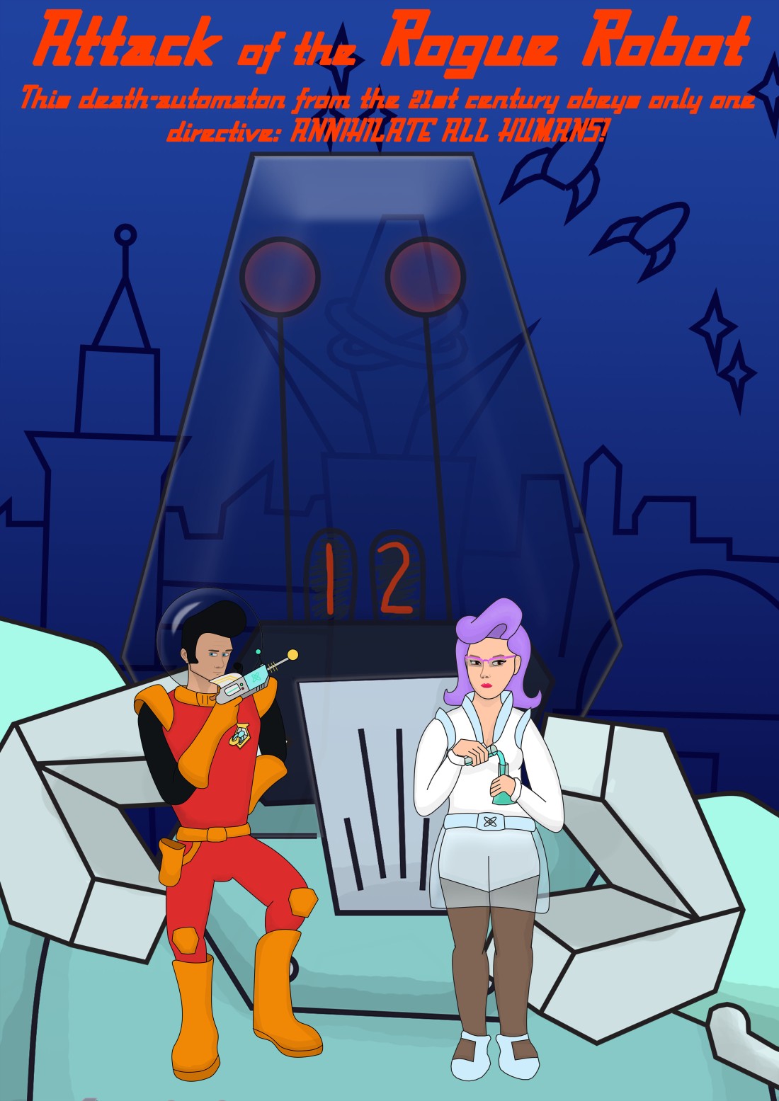
The group poster initially had multiple iterations. I settled on the draft that depicts the characters in the claws of the robot, but I didn’t like how this looked because it was too cluttered and didn’t flow well. I decided to scrap this version of the poster.
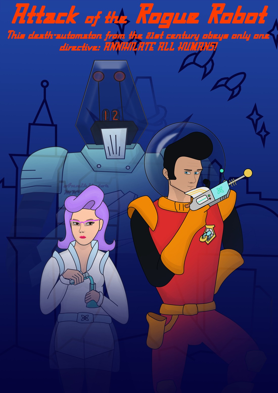
The final group poster is more akin to the style of Star Wars, which shows fading close-ups of multiple characters against the background. This composition looks much better and is more captivating than the previous iteration.