Questionnaire results and Post-NGF evaluation

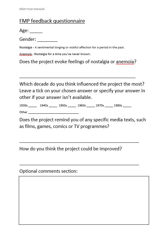
To collect feedback for the project, I have designed the following questionnaire.
Questionnaire

Although I initially planned to go the Norwich Games Festival, I was too nervous and didn’t want to present the project in person. Despite this, the project was still on display at the NGF and the questionnaire was still available to participants. The questionnaire got 4 responses from the NGF. I got the remaining 6 responses from art students at college.

10 questionnaires answered in total. Results:

Age: 17, 17, 17, 17, 19, 19, 23, 24, 30, 32

Age range: 17-32 (15 years)

Mean age: 21.5

Modal age: 17

Median age: 19

Gender: 5 male, 5 female

Does the project evoke feelings of nostalgia or anemoia?

8 yes, 1 no, 1 N/A

Most influential decade? (Some participants answered with multiple decades)

50s: 1 60s: 1 70s: 4 80s: 6 2000s: 1

Media texts:

Futurama, Godzilla vs Monster Zero. The other 8 answers were either left blank or were non-specific.

How could the project be improved?

3 unanswered, 4 responses based on background details or colour- “Too much blue”, 1 response based on character proportions “Some of the proportion is slightly off”, 1 based on shading “More shading”, 1 based on text “Difficult to read from a distance.”

Optional comments:

“Didn’t notice the robot had a head at first, blended in too much with the background.”

“Everything looks wonderful so far! Great work, dude! ^o^”

From the results of the questionnaire, I have concluded that the project was successful in evoking emotions of nostalgia and anemoia. However, the 50s retro-futuristic themes may not have been easily recognisable to the audience, who saw more of a 70s/80s influence.  Most of the criticism of the project was focused on the background, specifically that it was too blue and lacked colour variation. I made the decision to use a simple background with dark blue tones because I thought it looked best and contrasted with the characters, but some more experimentation could have yielded better results.

I regret avoiding the NGF. In hindsight, it may not have been too bad, but nerves got the better of me. I lacked the confidence to present the project because I wasn’t 100% proud of the final product, because I noticed flaws that others didn’t. However, the feedback from the questionnaire has alleviated some of my concerns.

(Changes have been made to the blog posts “Initial narrative and character bios” and “Preparing for the Norwich Games Festival”.)

Final poster development

When designing my final set of posters, I started with a set of drafts and final iterations of each character. Initially, the final set would include close-ups of each character, but I decided to change this. The final versions would have a full-body shot of each character, with a low-opacity close-up in the background. This made the posters more interesting and dynamic.

Future city

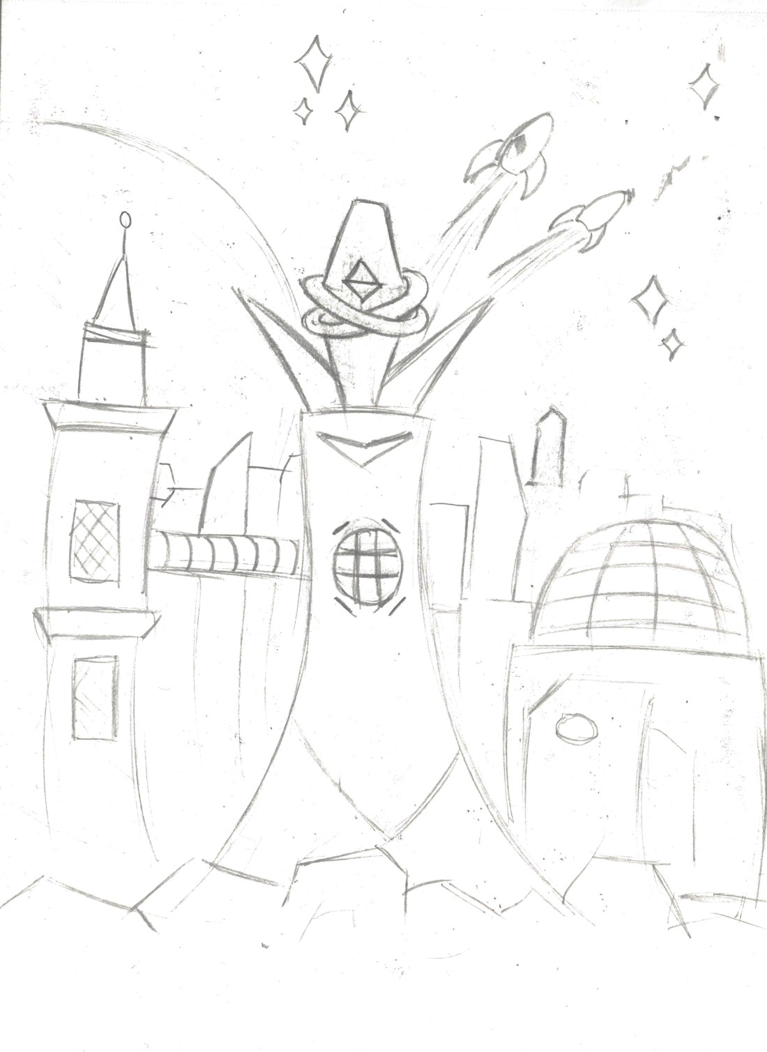
When editing the character solo posters, I found there was a lot of empty space in the background. To remedy this, I drew a cityscape and traced it in Illustrator. Initially, it would be in full colour and would have details such as windows, but this made the background look too cluttered. For the final background, I settled on a minimalist approach, using simple outlines to fill the space.

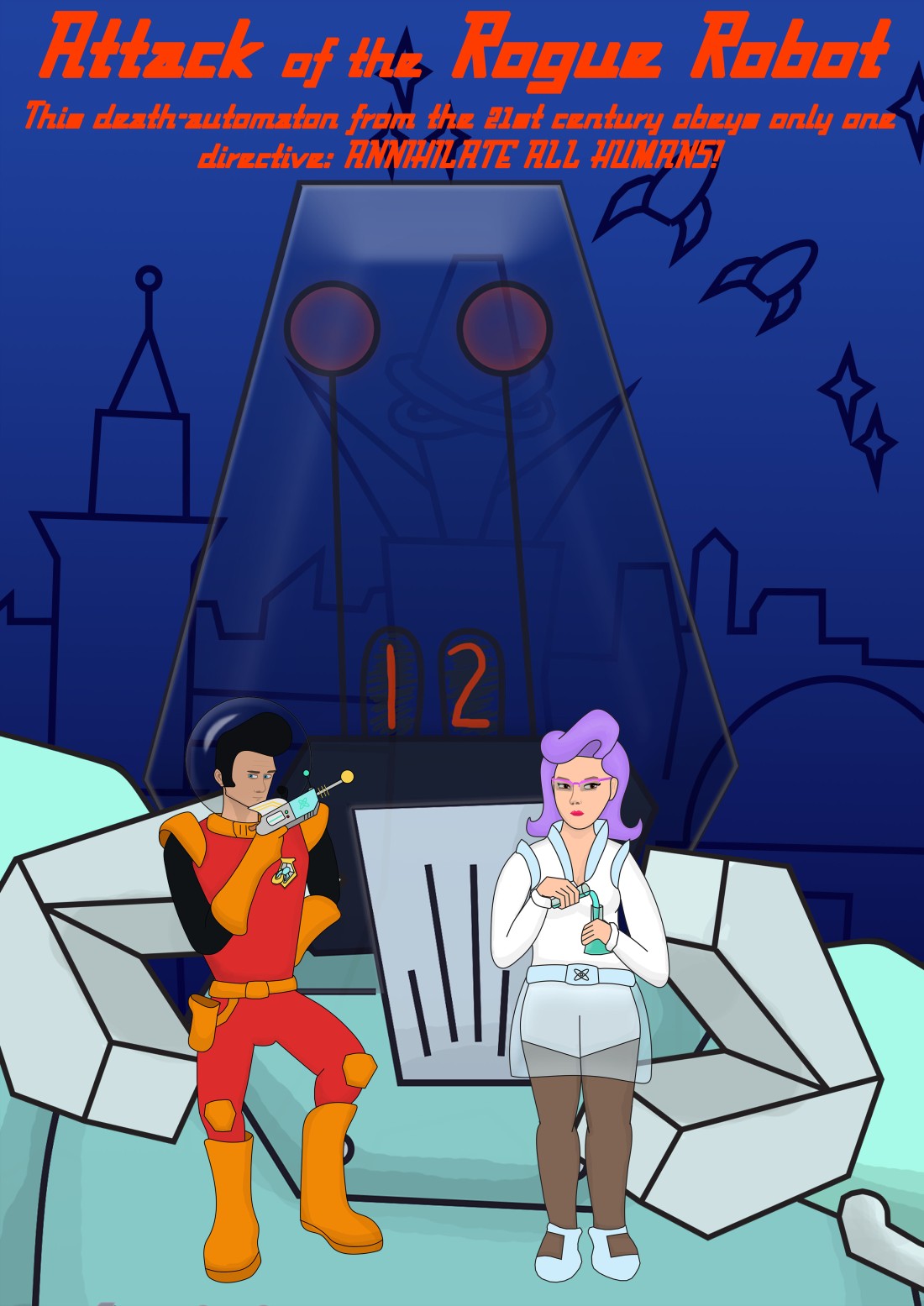
The group poster initially had multiple iterations. I settled on the draft that depicts the characters in the claws of the robot, but I didn’t like how this looked because it was too cluttered and didn’t flow well. I decided to scrap this version of the poster.

Group poster

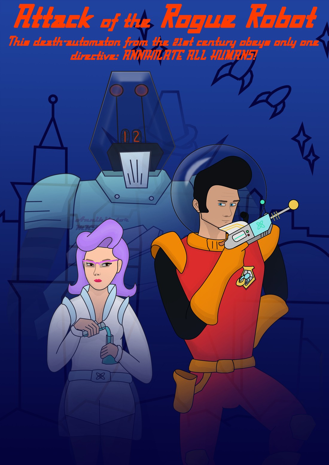
The final group poster is more akin to the style of Star Wars, which shows fading close-ups of multiple characters against the background. This composition looks much better and is more captivating than the previous iteration.

Group poster 2

Ray gun development

The 4 initial ray gun concepts.

Ray gun 1 is the design I had in mind since the very beginning of the project. It is a revolver with atompunk ray gun details. Simple but effective.

Ray gun 2 is another revolver, but it has more of a cyberpunk aesthetic akin to works such as Blade Runner and Altered Carbon. While I like this design, it would look out of place in a 50s B-movie, so I decided to scrap it.

Ray gun 3 is more of a retro, familiar design that could easily be used in a 50s style B-movie.

Ray gun 4 is basically just a re-skinned Mauser C96, like Han Solo’s blaster.

Ray gun final

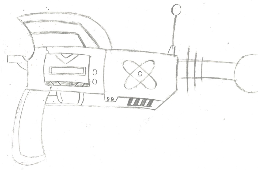
The final ray gun concept. This iteration is mainly based on ray gun 1, with some extra details.

The final ray gun with colour. I used silver and gold to make it look like a powerful weapon that packs a punch, as opposed to a plastic toy. I also used some blue and green to retain the B-movie aesthetic and prevent the ray gun from looking too serious.

00206BB779EB190214102003

I also reused the ray gun colour palette on the Space Marine’s badge.

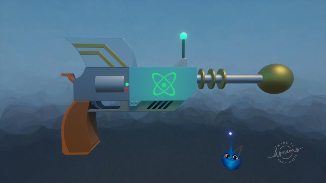
As a side-activity, I wanted to 3D model the ray gun. My tutor said I wouldn’t have time. I made this in 3 hours using Dreams on PS4 just for fun!

Preparing for the Norwich Games Festival

To collect feedback for the project, I will present it at the Norwich Games Festival.

Identify target audience:

An important tool for deciding on a target audience is PEGI. PEGI (Pan European Game Information) is a system that gives games age ratings based on their content. Age ratings range from 3 to 18 and content descriptors include violence, bad language, fear, gambling, sex, drugs and discrimination. The less offensive content a game contains, the lower the age rating will be. To display my work to all at the game festival, it should fall into an age range of 3 to 7.

The target audience of the Games Festival includes families, gamers of all ages and game developers.

The target audience for my project is family, because it is retro, B-movie sci-fi, with content that is family friendly, but most likely to appeal to teens and young adults.

Social media:

To promote the project, I will use Facebook and Twitter. This will allow my project to reach a larger audience and promote the event. The advantage of using Facebook is that posts can be shared via groups, allowing it to reach those who are interested in visiting the Games Festival. The advantage of using Twitter is that posts are limited to 240 characters, which makes them easier to read and attract the attention of the audience. Features such as sharing and hashtags are present on both platforms. The following are my posts with images to accompany them. The Twitter post is shorter to fit the character limit.

Twitter:

Hi, I’m Elliot Frost Warwick. I’m a game design student & amateur artist at East Coast College. I will present my concept art project at the @NorwichGFest. I am producing a set of posters for a conceptual 50s style sci-fi B-movie.

Facebook:

Hi, I’m Elliot Frost Warwick. I’m a game design student & amateur artist at East Coast College. I will present my concept art project at the Norwich Games Festival. I am producing a set of posters for a conceptual 50s style sci-fi B-movie. The theme of our final major project is “emotions”. Each project must be designed to evoke a specific emotion. I have chosen “anemoia”- nostalgia for a time one hasn’t experienced. I intend to do this by replicating the style of 50s B-movie posters.

(Include the first 4 images in the Twitter post, include all 5 in the Facebook post.)

Individual:

The presentation at the Games Festival will consist of all 4 final printed posters, a computer with an image album set to slideshow, which includes the final posters and all concept art. I will also include a document that explains the project. For this presentation, I will not create any promotional material besides the social media posts, because I don’t have any professional content to promote. However, if I was going to create promotional material, I would choose business cards because they can be mass-produced and contain social media and contact details.

To collect feedback, I will design a questionnaire that includes quantitative questions and an optional comment section for qualitative feedback. This gives the audience freedom to quickly answer the quantitative questions and go into greater detail if they choose to. This would be the best of both worlds, because it would have the advantages of both types of feedback.

When responding to feedback, I must be prepared for criticism. I should take constructive criticism onboard, and ask for specific criticism when faced with vague responses such as “I don’t like it”. I must be polite and take negative criticism positively.

One more thing I must consider is how to display my posters using the materials available to me. At the NGF, I will have access to a whiteboard. I will not be able to use pins or Blu-tack to attach the posters to the whiteboard, so I should consider alternative options such as Velcro tape.

Character face development

To design my character faces, I started by copying faces from an anatomy book and adding my characters’ features.

I did not like the result of this. Because I copied drawings instead of photos, the end result had a sort of uncanny valley effect. To fix this, I did some more practice sketches based on references.

To design the final iterations of the character faces, I copied photo references and added my characters’ features. I also drew the robot’s face, which was easy, because it’s a simple design I had already drawn.

Overall, I am proud of the final face sketches.